Disney Speedstorm: Environments
The Project
During my time at Gameloft Barcelona, I had the privilege of working on Disney Speedstorm as Lead Concept Artist and later as Associate Art Director.
Early on, Art Director Nacho Yagüe entrusted me with a key challenge: defining the visual language for the environments and vehicles. We had to balance complex gameplay needs for a multi-platform title while ensuring the game looked unique and highly readable.
Managing so many different Disney IPs was an incredible but difficult challenge. Each had its own colors, mood, and proportions. Instead of just making carbon copies of the original styles, we needed to unify them under a consistent visual identity. Creating common design elements across all maps was fundamental to achieve this....
During my time at Gameloft Barcelona, I had the privilege of working on Disney Speedstorm as Lead Concept Artist and later as Associate Art Director.
Early on, Art Director Nacho Yagüe entrusted me with a key challenge: defining the visual language for the environments and vehicles. We had to balance complex gameplay needs for a multi-platform title while ensuring the game looked unique and highly readable.
Managing so many different Disney IPs was an incredible but difficult challenge. Each had its own colors, mood, and proportions. Instead of just making carbon copies of the original styles, we needed to unify them under a consistent visual identity. Creating common design elements across all maps was fundamental to achieve this.
DISCLAIMER: MANY OF THE CONCEPTS BELOW WERE CREATED DURING PRE-PRODUCTION AND DID NOT MAKE IT INTO THE FINAL GAME.
The Silver Screen
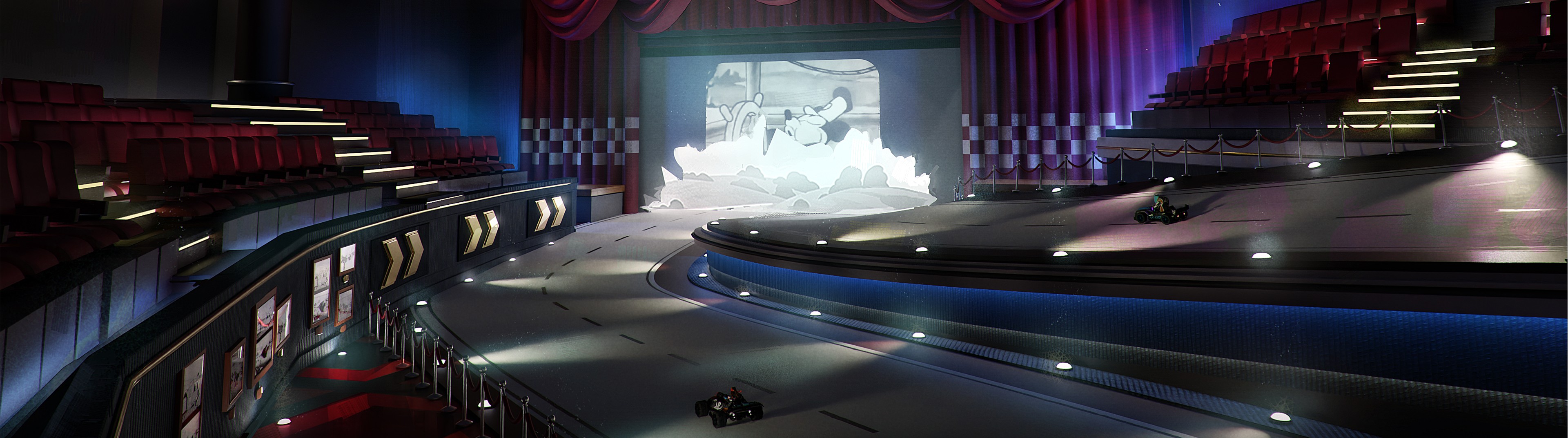
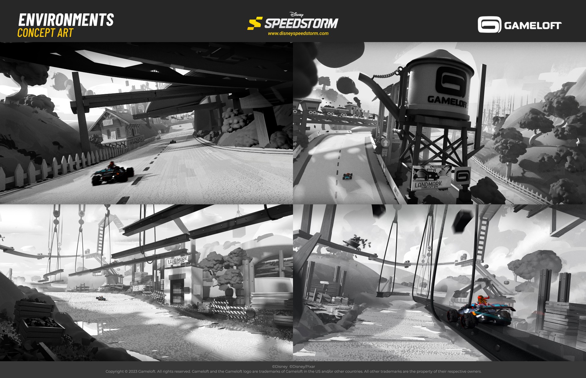
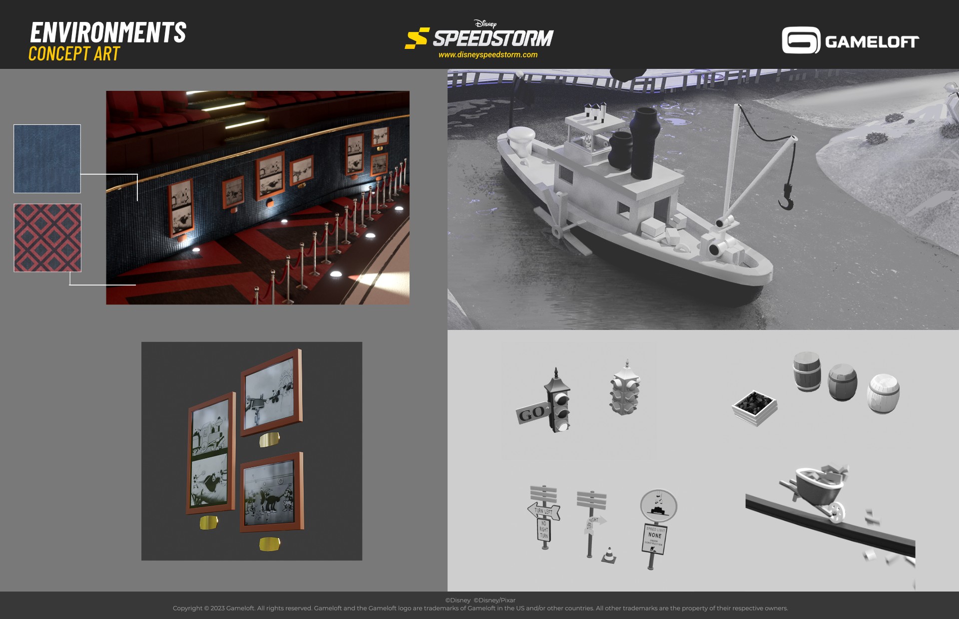
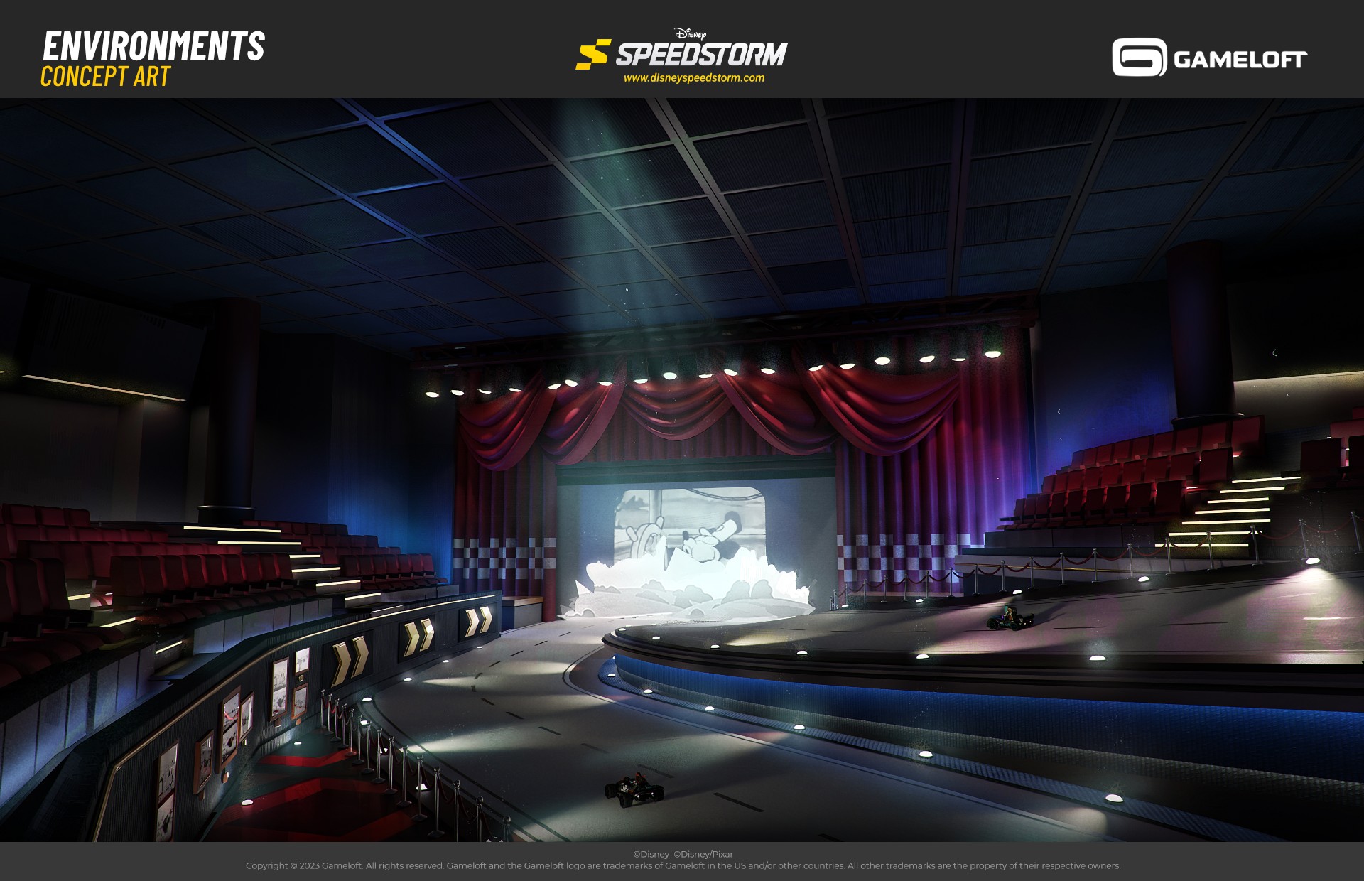
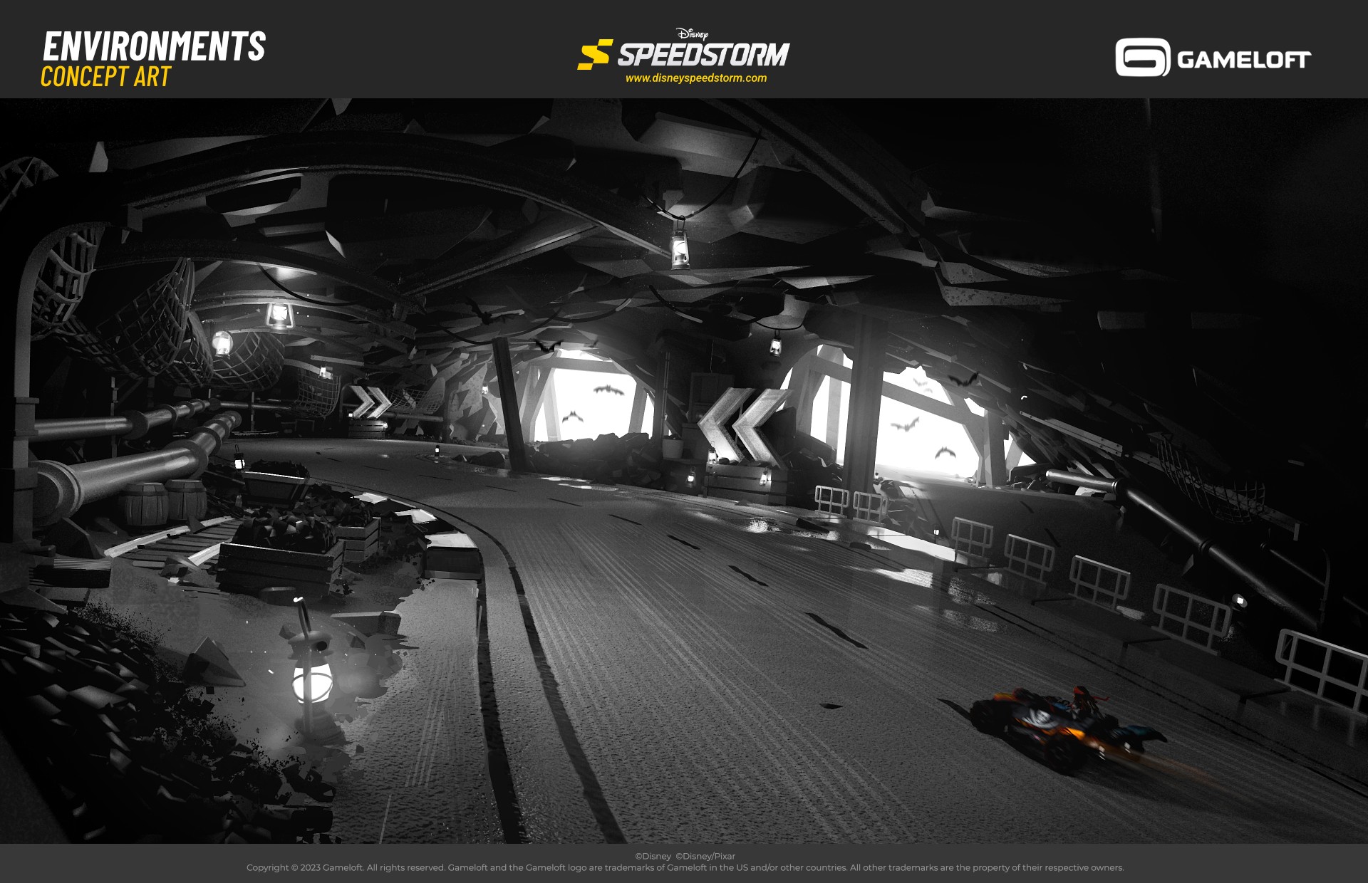
At some point during the project, it was time to design a level inspired by the classic Steamboat Willie short film from Disney. We thought it would be a nice touch if a specific part of the track had an area in color rather than fully black and white like the rest of the environment. It would create a nice contrast for the player and would help make things more dynamic. It quickly became one of the most iconic tracks in the entire game....
At some point during the project, it was time to design a level inspired by the classic Steamboat Willie short film from Disney. We thought it would be a nice touch if a specific part of the track had an area in color rather than fully black and
white like the rest of the environment. It would create a nice contrast for the player and would help make things more dynamic. It quickly became one of the most iconic tracks in the entire game.
World Building
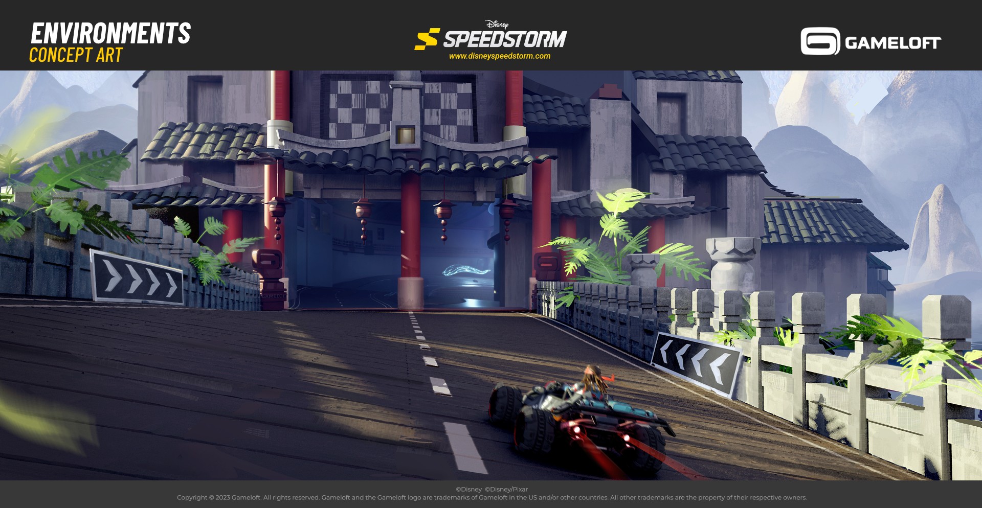
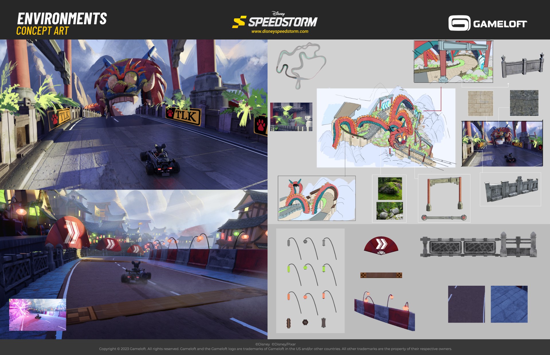
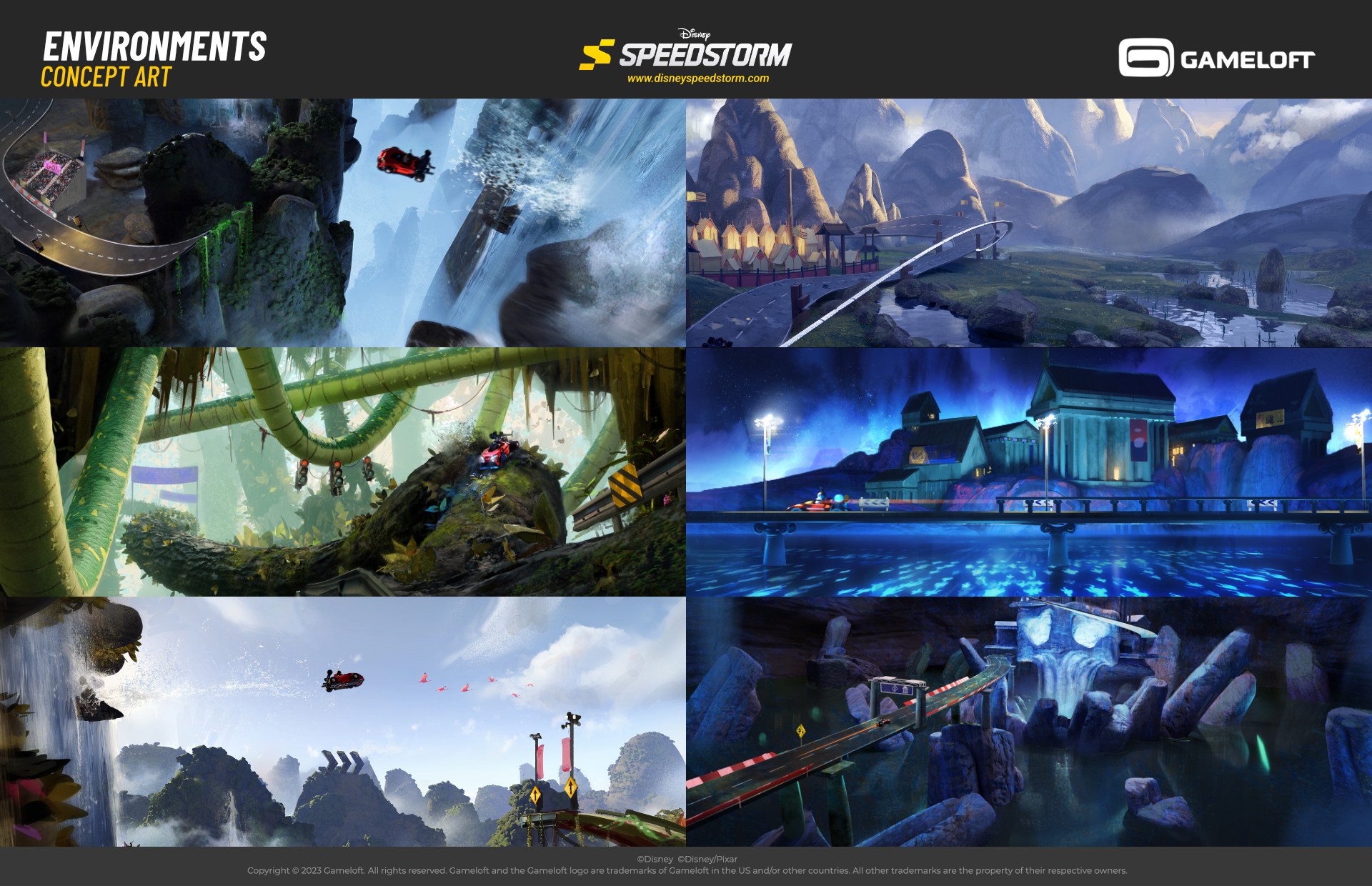
My main task was to find a way to avoid making a carbon copy of the original IPs. We needed to unify them with consistent visuals and common design elements. Below, you can see several examples: Dragon Valley, A Pirate’s Life, and Jungle Ruins....
My main task was to find a way to avoid making a carbon copy of the original IPs. We needed to unify them with consistent visuals and common design elements. Below, you can see several examples: Dragon Valley, A Pirate’s Life, and Jungle Ruins.
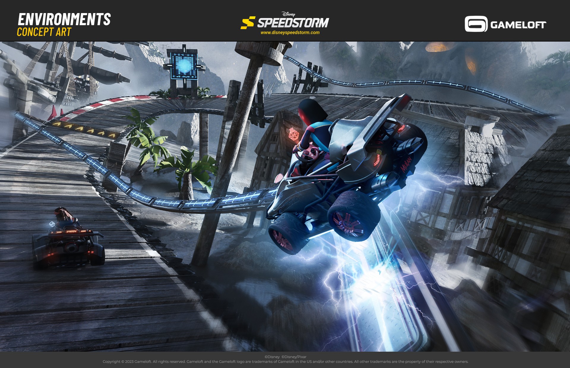
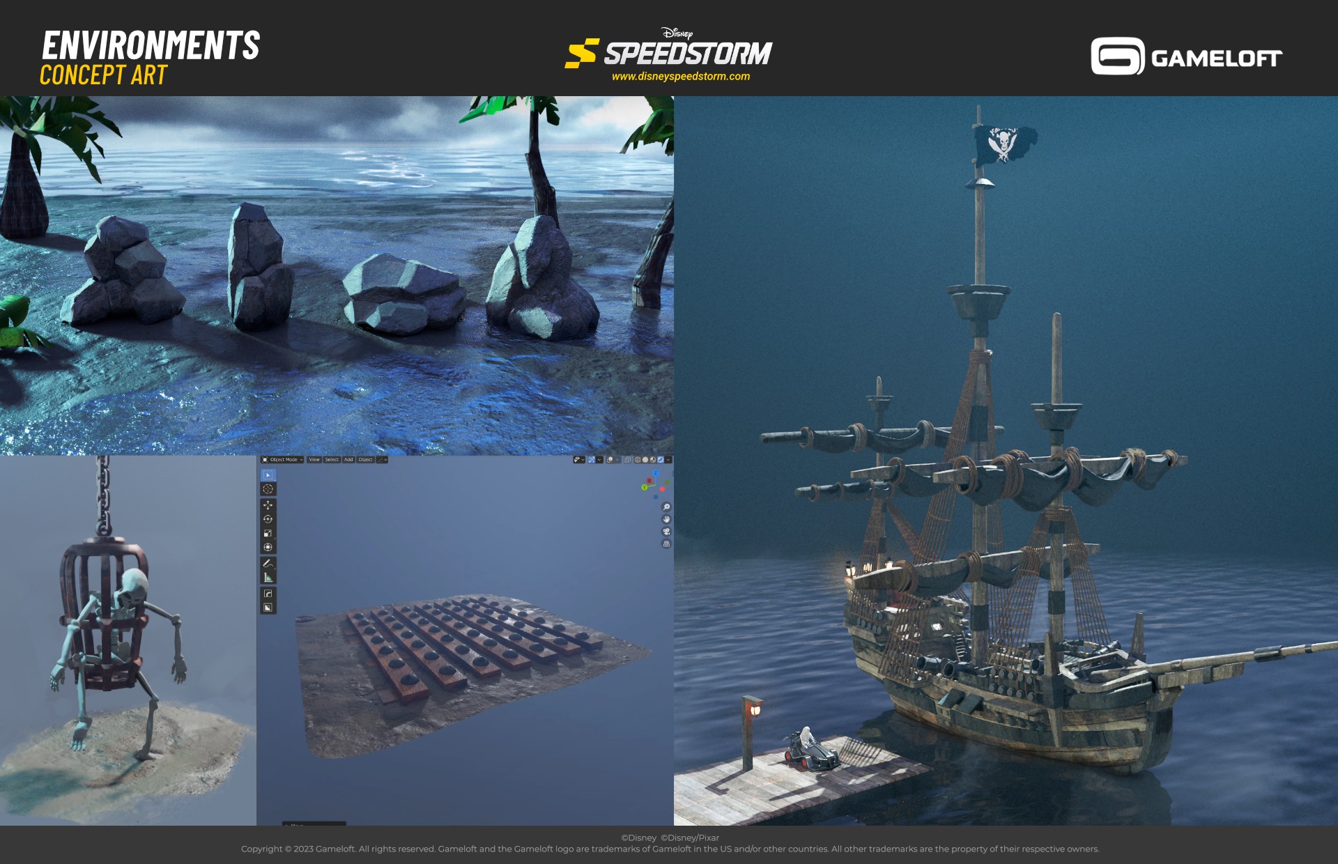
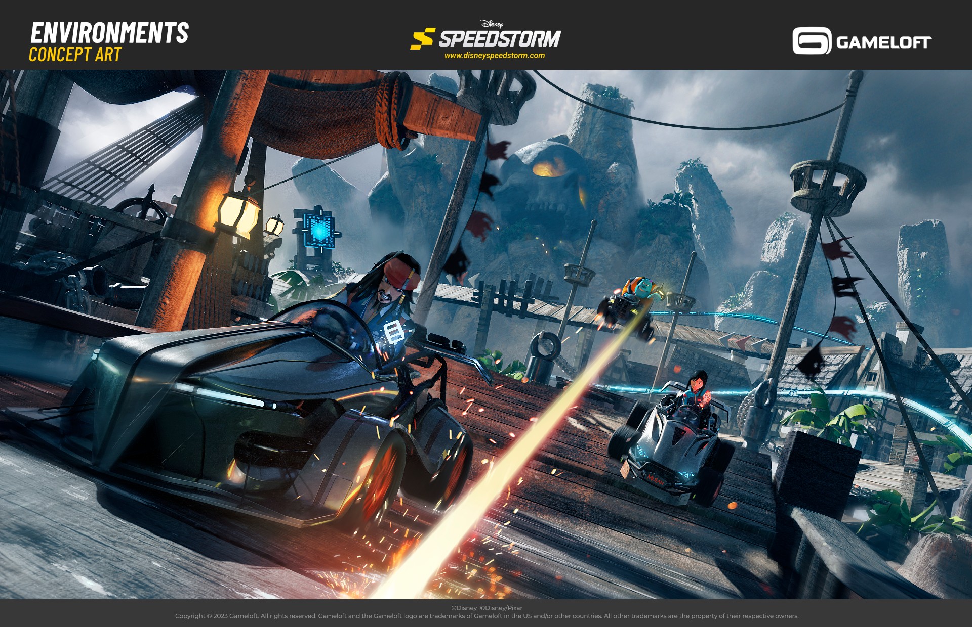
Probably one of the most challenging tracks, as it referenced a very realistic IP. Going super dark was the obvious choice in A Pirate’s Life, but a huge problem for a racing game. Instead, we used bright moonlight to fake the night effect while keeping the track clear and readable....
Probably one of the most challenging tracks, as it referenced a very realistic IP. Going super dark was the obvious choice in A Pirate’s Life, but a huge problem for a racing game. Instead, we used bright moonlight to fake the night effect while keeping the track clear and readable.
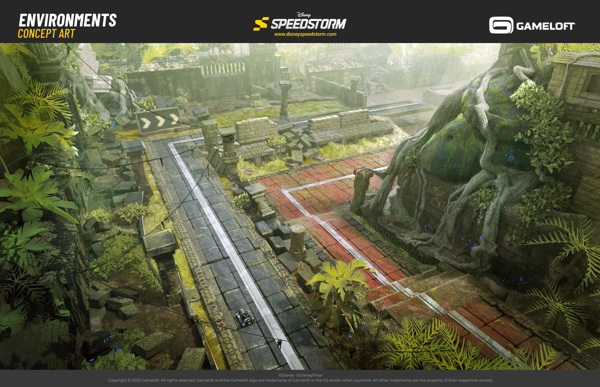
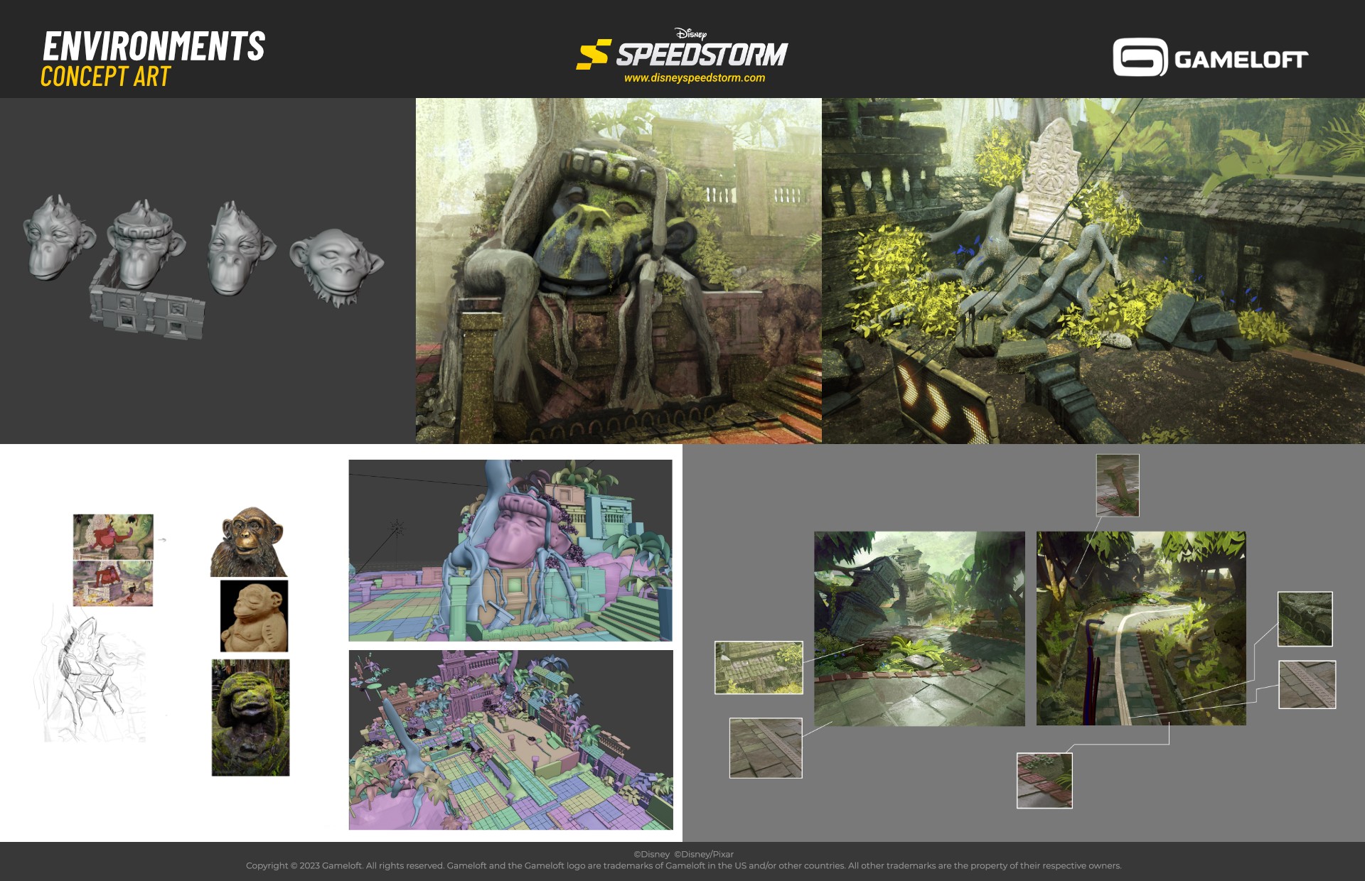
With Jungle Ruins, the main challenge was cutting through visual noise of dense vegetation. We relied on big, bold shapes and stylized foliage to keep the track clean and easy to read at high speeds....
With Jungle Ruins, the main challenge was cutting through visual noise of dense vegetation. We relied on big, bold shapes and stylized foliage to keep the track clean and easy to read at high speeds.
Big, Medium, Small
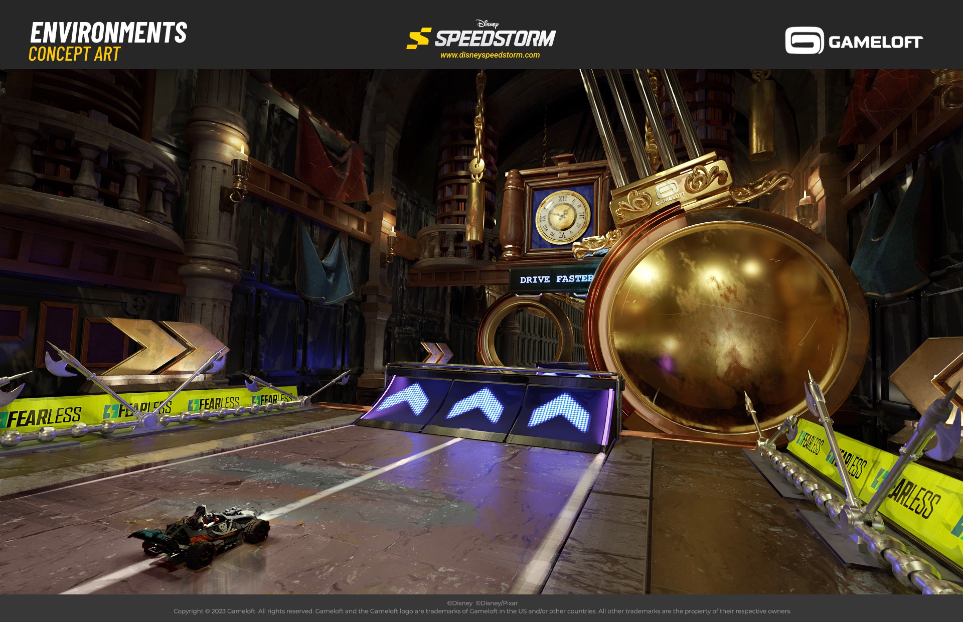
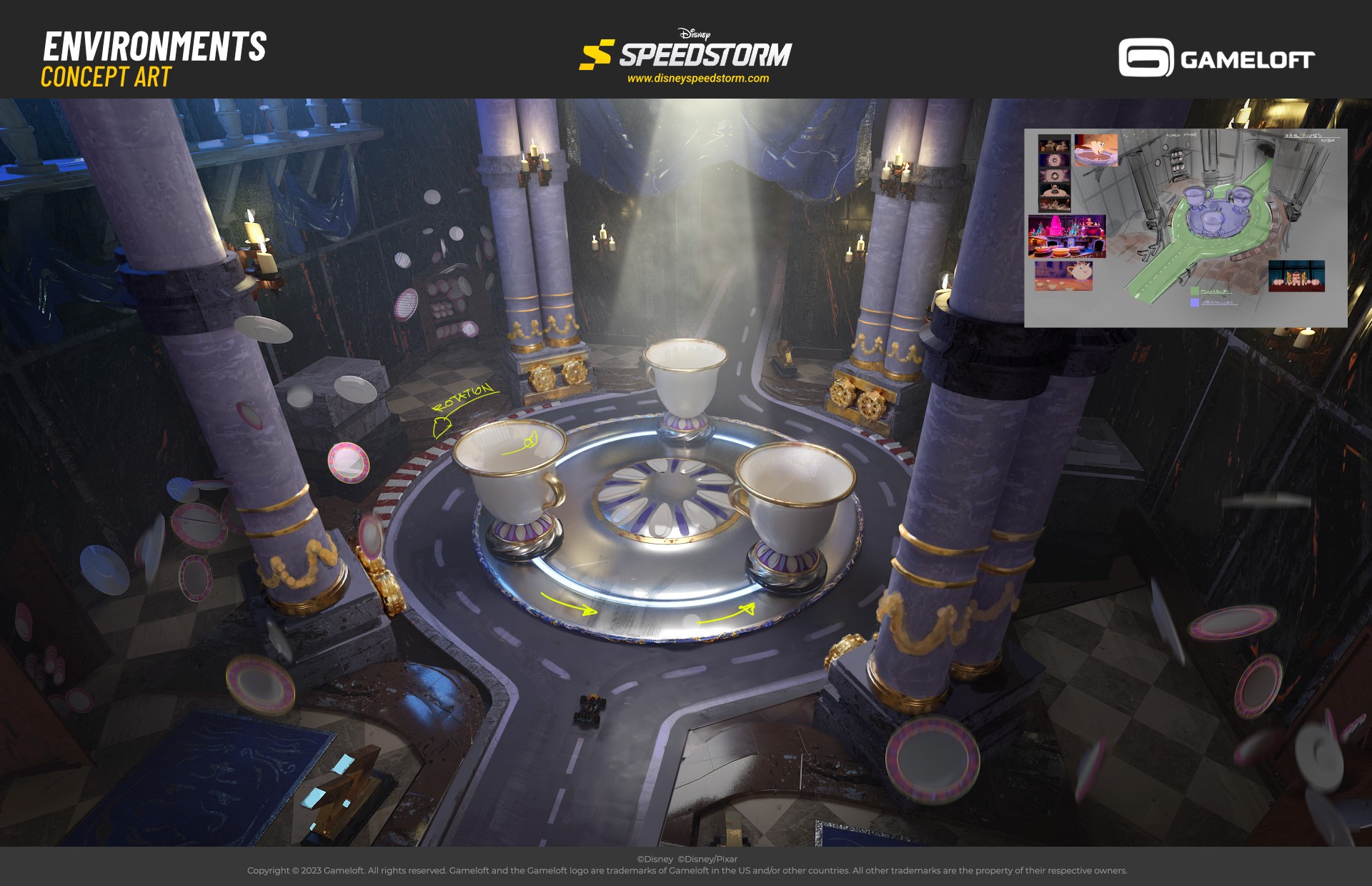
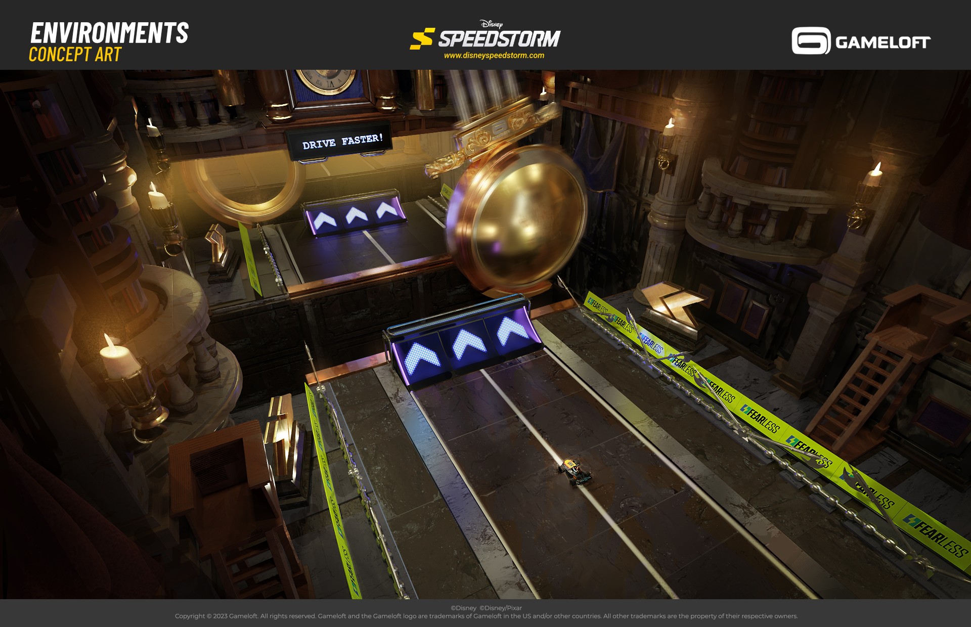
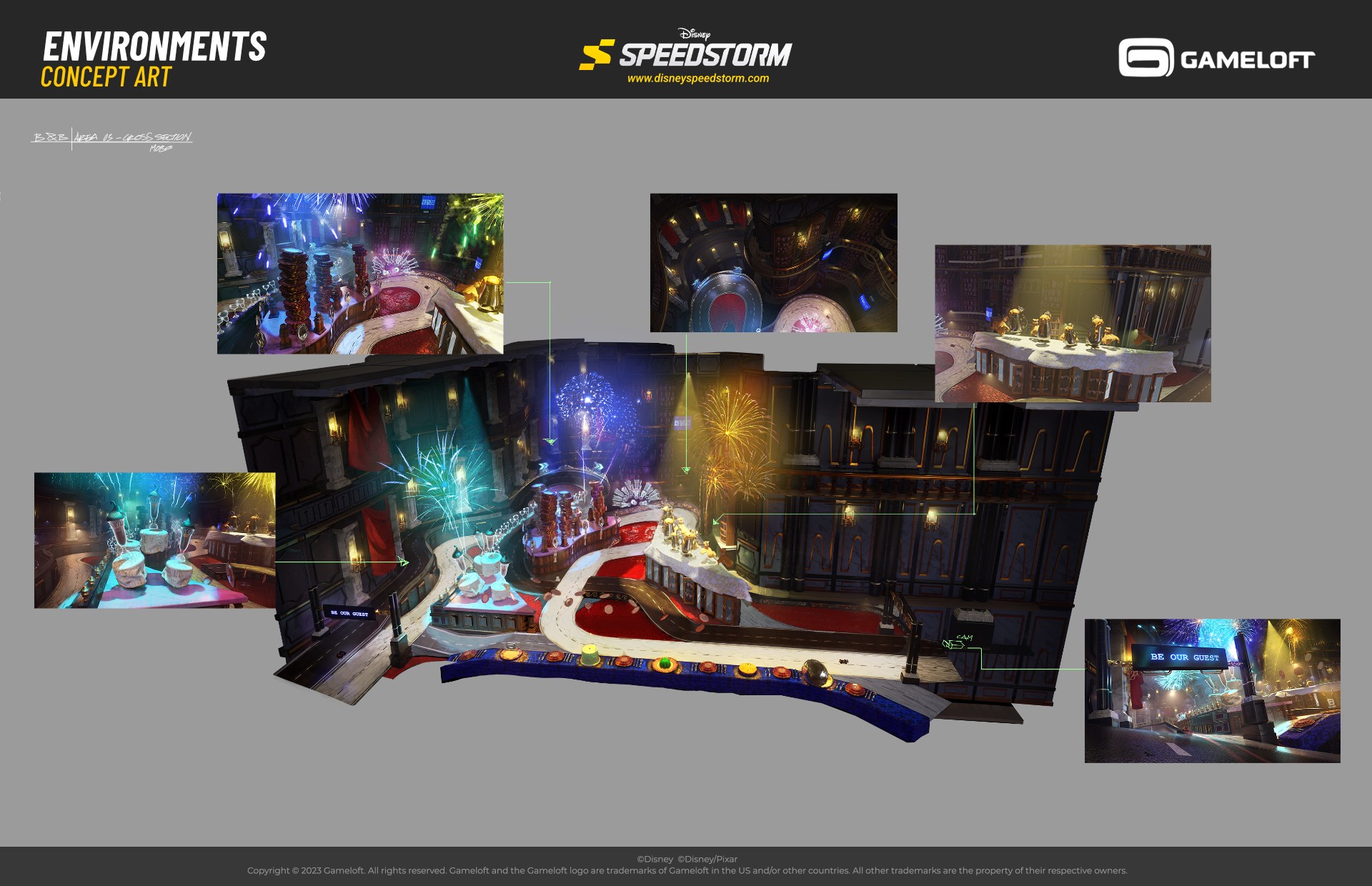
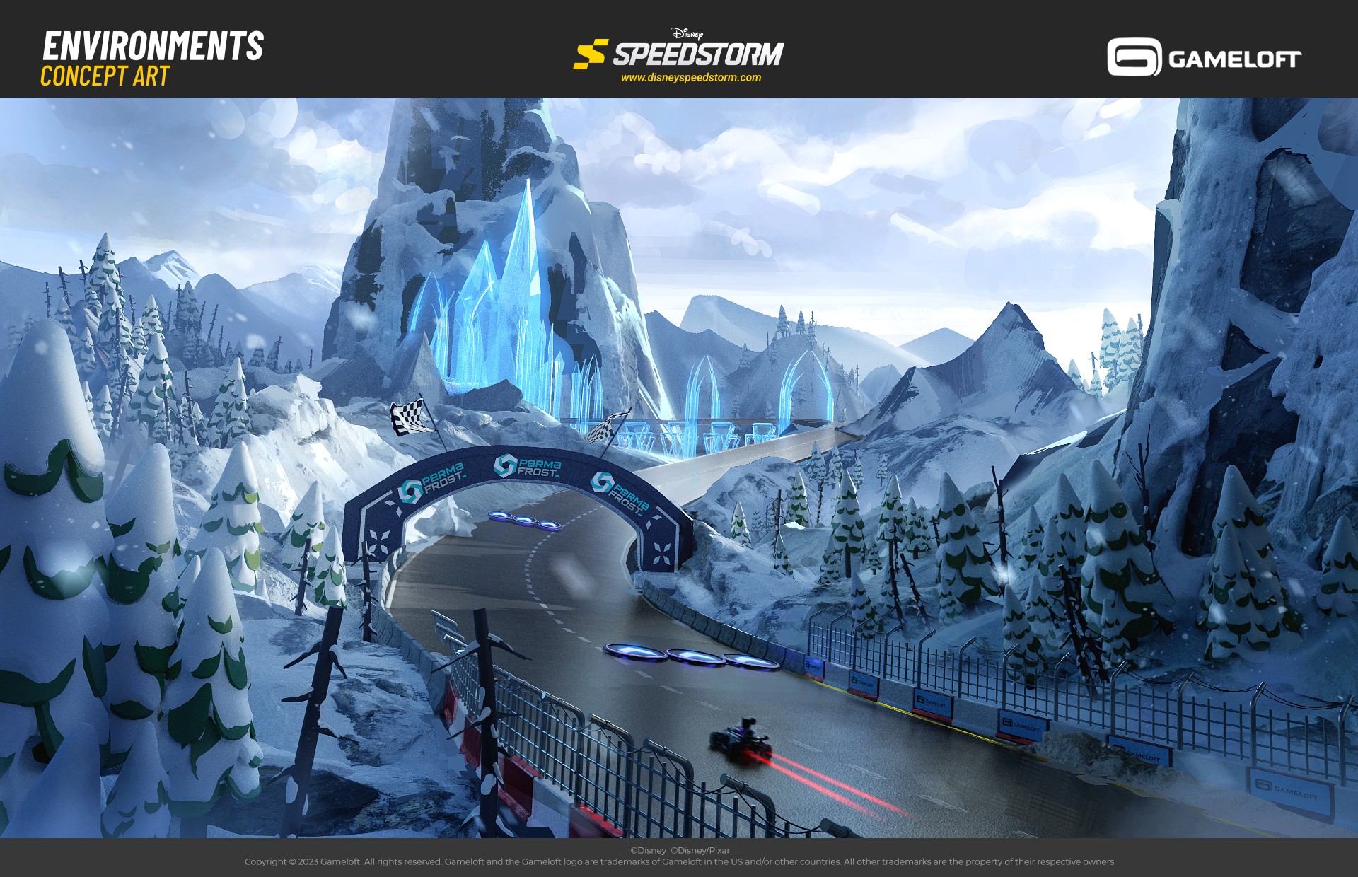
Another major challenge was preventing the cars and characters from feeling like miniatures. Designing racing games always involves scale trade-offs: elements need to be large for readability, but overdoing it can make the game feel sluggish. To counter this, we scattered smaller environment details along the tracks to boost the sense of speed. It was also the perfect excuse to pack the levels with racing props that grounded the whole world. I’m sharing The Castle track below because it was, by far, the one that required the most attention to all this....
Another major challenge was preventing the cars and characters from feeling like miniatures. Designing racing games always involves scale trade-offs: elements need to be large for readability, but
overdoing it can make the game feel sluggish. To counter this, we scattered smaller environment details along the tracks to boost the sense of speed. It was also the perfect excuse to pack the levels with racing props that grounded the whole world.
I’m sharing The Castle track below because it was, by far, the one that required the most attention to all this.
The Mood
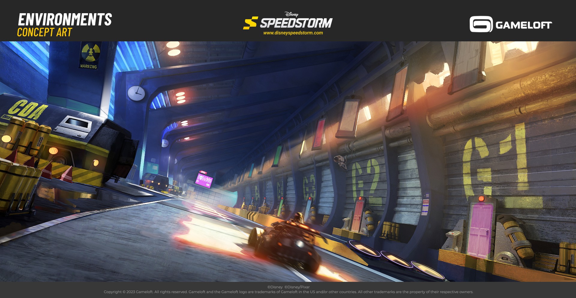
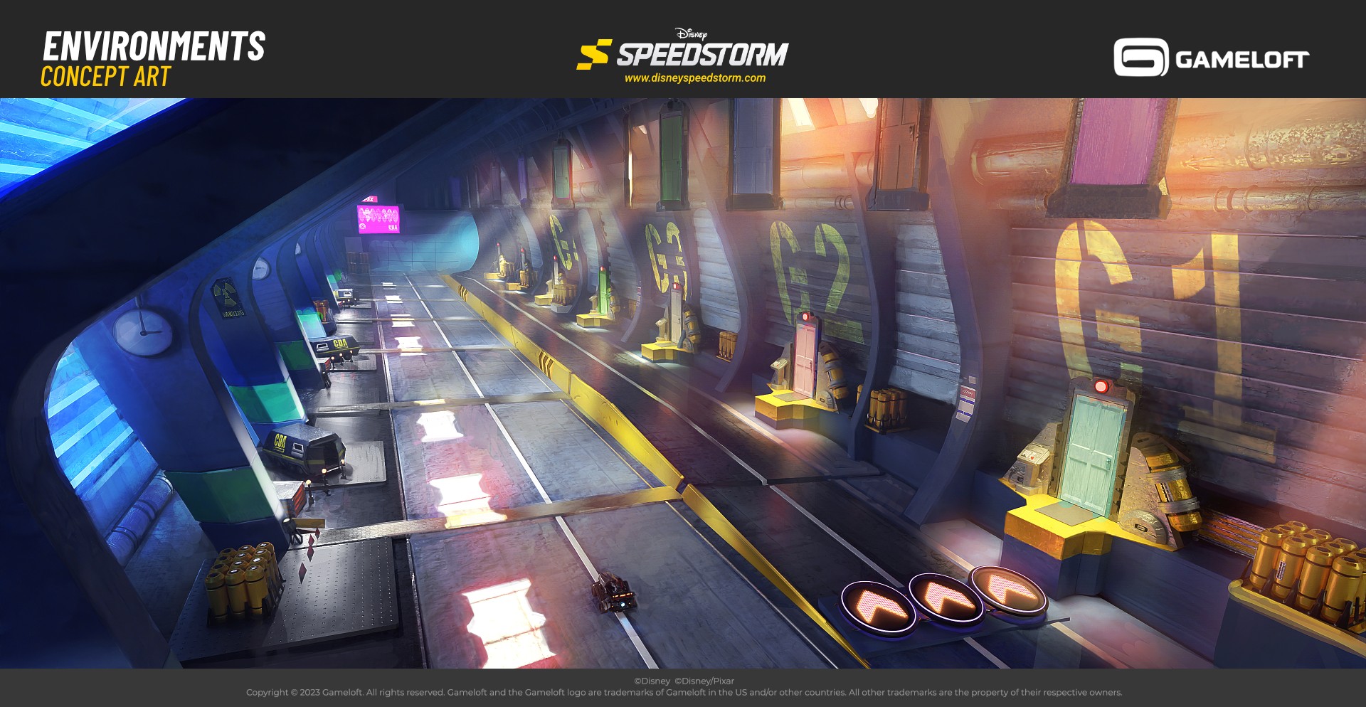
Very early in the project, my task was to quickly establish rough sketches that would serve as a visual guide for the entire style of the game. It’s still one of my favorite parts of the process — there’s always so much freedom in shaping the world from scratch....
Very early in the project, my task was to quickly establish rough sketches that would serve as a visual guide for the entire style of the game. It’s still one of my favorite parts of the process — there’s always so much freedom in shaping the world from scratch.
// Thanks for watching
